
Our client partners often struggle with formatting data collection sheets. Without a solid structure, the analysis phase becomes tedious (or even impossible).
As we help clients dig into home-grown Excel data sheets, we find they have the best intentions of collecting performance data. However, when they attempt to analyze the data, they discover that the way they are formatting data limits their ability to create actionable intelligence and visualizations.
Common issues include using any text entry that the user chooses, keeping different time periods on separate tabs, and not standardizing reason codes for downtime or scrap.
Preparing Data for Analysis in Excel, Power BI, or Tableau
Excel, Power BI, Tableau, and Minitab are powerful tools for data analysis, but before you can get started with analysis, formatting data correctly becomes a priority. Proper data formatting is crucial to ensuring that you can work with your data accurately and efficiently.
You may be asking, Where do we start?
Here are 4 simple steps to take formatting data for Excel or Power BI to the next level:
Step 1Organize your data collection
To perform data analysis, your data collection must first be organized in a way that makes the analysis simple. We must think about how the software we use processes the data. For ease of computation, it is best to put all the data in one single table or database. Related data should be organized, with different types of data separated into columns.
It is best practice to format all data in the same table or database. Commonly, we see some managers practice storing weeks or months of data on separate Excel worksheets. This makes the analysis difficult due to having to amalgamate all the individual tables into one. In this scenario, the person who sets up the analysis will end up performing multiple moves with the data, and there will be an additional element of human error introduced. Additionally, someone will inevitably change the structure of one or more of the individual tabs, and then a simple copy and paste becomes tedious.
When we design our data table, we want to make it as simple as possible for the analysis phase.
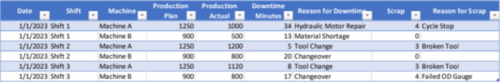
For example, to format a table that contains machine production and downtime data, you could use a format that includes the following columns:
- Data: The date of the production and downtime data.
- Shift: The shift during which the production and downtime data were collected. For example, if you have a two-shift system, you might have a "Shift 1" and "Shift 2" column.
- Machine: The machine or machines that are being monitored for production and downtime data.
- Production Plan: The amount of product produced by each machine during the shift. This can be measured in units, pounds, or another appropriate unit of measure.
- Production Actual: The amount of product produced by each machine during the shift. This can be measured in units, pounds, or another appropriate unit of measure.
- Downtime: The amount of time each machine was down during the shift. This can be measured in minutes, hours, or another appropriate unit of time.
- Reason for Downtime: The reason why each machine was down during the shift. This can include maintenance, repairs, material shortages, or other reasons. Note that formatting this into standardized reason codes is the proper approach. Specific wording allows for the summing of the data during analysis and unlocks the ability to perform pareto analysis.
- Scrap: The number of scrap parts from the production run.
- Reason for Scrap: Similar to the Reason for Downtime, using standard codes for the reason allows for simple data analysis.
This format allows you to easily track production and downtime data for each machine on each shift. You can use this data to identify trends and areas for improvement, such as machines that are frequently down or areas where production can be increased. You can also use this data to calculate key performance indicators (KPIs) such as overall equipment effectiveness (OEE) and downtime percentage.
Here is an example of what the table might look like:
Step 2Standardize data formats
Standardizing data refers to the process of using consistent formats for data types such as dates, currencies, and percentages. The goal is to make sure that the data is uniform and can be used consistently throughout your data set.
Standardizing your data is important for several reasons. First, it makes it easier to work with your data and reduces the risk of errors. Second, it can improve the accuracy of your analysis by making it easier to compare and combine data.
Here are some examples of how to standardize data:
- Dates: Use a consistent format for all dates, such as "mm/dd/yyyy" or "yyyy-mm-dd". This will make it easier to sort and filter your data by date.
- Currency: Use a consistent currency symbol and decimal point for all currency values. For example, you might use "$" for US dollars and "." as the decimal point. ($164,700.00).
- Percentages: Use a consistent format for percentages, such as 50% or 0.5. This will make it easier to compare and analyze data that includes percentages.
- Text: Use a consistent format for text values, such as using proper capitalization and avoiding abbreviations. This will make it easier to search and sort your data. Use drop-down boxes whenever possible to guarantee consistency.
When standardizing your data, it’s important to be consistent throughout your data set. If you use different formats for the same data type, it can lead to confusion and errors in your analysis.
Step 3Check for data accuracy and completeness
After you ensure that you have consistency in formatting your data, you need to make sure that it is accurate and complete. This means checking for errors, missing data, and inconsistencies. If your data is inaccurate or incomplete, it will be difficult to work with and could lead to inaccurate analysis results. Inaccurate analysis results could lead to a waste of your time, or they could risk your professional image and even damage working relationships.
Here are a few ways to identify incomplete data:
- Check for missing values: One of the most obvious signs of incomplete data is missing values. Incomplete data may have blank cells or placeholders such as "N/A" or "Not available". Check your data to ensure that there are no missing values that could indicate incomplete data.
- Compare data across sources: If you have data from multiple sources or time periods, compare the data to see if there are any discrepancies or missing data points. Incomplete data may be missing from one source but present in another.
- Look for gaps in time periods: If your data covers a specific time period, check to see if there are any gaps in the data. Missing data for a particular day or week could indicate incomplete data.
- Check the data for illogical relationships: If your data includes calculations or relationships between variables, check to see if they are consistent across the data set. Incomplete data may have inconsistent or illogical relationships between variables. Example: The normal person who collected the data was on vacation, and the backup entered the data in pounds instead of cases produced.
- Consider the context: Sometimes context can provide clues to incomplete data. For example, if you have data on customer orders but there are no orders for a particular product or region, it could be a sign of incomplete data.
If you identify incomplete data, you may need to take steps to fill in the missing data or adjust your analysis accordingly. Depending on the nature and extent of the incomplete data, this may require additional data collection, analysis, or assumptions. It’s important to be transparent about any incomplete data and how it may affect your conclusions or recommendations. Always inform the audience if there are assumptions being made to fill in gaps from incomplete data sets.
Step 4Remove duplicates
Duplicate data can cause problems when analyzing it, so it is important to remove duplicates. Having categories or segments of the data repeat can skew the analysis significantly. You can do this manually or by using Excel’s built-in Remove Duplicates function or Power BI’s Remove Duplicates transformation.
Note that when removing duplicates, you can choose to keep the first occurrence of each duplicate value or the last occurrence. You can also use conditional formatting to highlight duplicate values instead of deleting them, allowing you to review them manually and decide whether to keep or remove them.
No matter how you perform the review and removal of duplicates, it’s important to review the data carefully after removing duplicates to ensure that the remaining data is still accurate and meaningful. In some cases, removing duplicates may have unintended consequences, such as making an error that leads to a gap in the data. Therefore, it’s important to be cautious when removing duplicates and to have a clear understanding of the data and how it will be used.
Next Steps
Once your data is cleaned and prepared, you can begin to analyze it. Microsoft Excel, Power BI, or Tableau can be used to create charts, tables, and other visualizations to help you understand patterns, trends, and relationships in the data. The goal is to identify any insights or trends that can help you make better decisions.
Remember that data cleaning and analysis are iterative processes. You may need to go back and repeat steps or perform additional cleaning and analysis as you uncover new insights and information. You may notice visual outliers in the charts and research that indicate some unusual special cause needs to be removed. However, by following the above steps, you can be confident that your data is accurate, consistent, and meaningful, and that you are able to use it to make informed decisions.
The POWERS Difference
We are a dedicated and results-driven management consulting firm uniquely positioned at the intersection of workplace culture and operational performance. We partner with growth-oriented organizations to cultivate a culture of excellence that fuels productivity, drives efficiency, and strengthens competitive advantage.
Leveraging our deep industry expertise and innovative methodologies, we build synergies between people and processes, creating holistic, sustainable change that translates into measurable business outcomes.
Our team has helped executive leadership across many industries operationalize their culture for rapid and sustained performance improvement, increased competitive advantage, greater value, and a stronger bottom line.
To put our experienced team and proven track record to work for you, schedule an initial discovery and analysis by calling +1 678-971-4711, or emailing us at info@thepowerscompany.com